Visual identity
Our visual identity consists of key characteristics that work together to reflect our bold and youthful approach. You can download these guidelines as a PDF (8.1MB).
Logo
The WorldSkills logo consists of two components: the icon and the wordmark.
The five sweeping lines of the WorldSkills icon represent the hands of youth — reaching out for new skills.
Our logo was designed by Teaho Yang, a graphic design student at Mokwon University in Korea in 2000, following a global design competition for students.
The logotype has been designed to complement the symbol and is based on the competition finalist design from Kathrin Baldo and Andreas Alber of Italy.

The wordmark is based on Frutiger, and can be separated from the icon — only when the full logo does not fit the design restrictions.
The WorldSkills icon, wordmark, and logo are always monochrome dark blue, white, black, or grey.
When used together the icon is always positioned above the wordmark in this way.
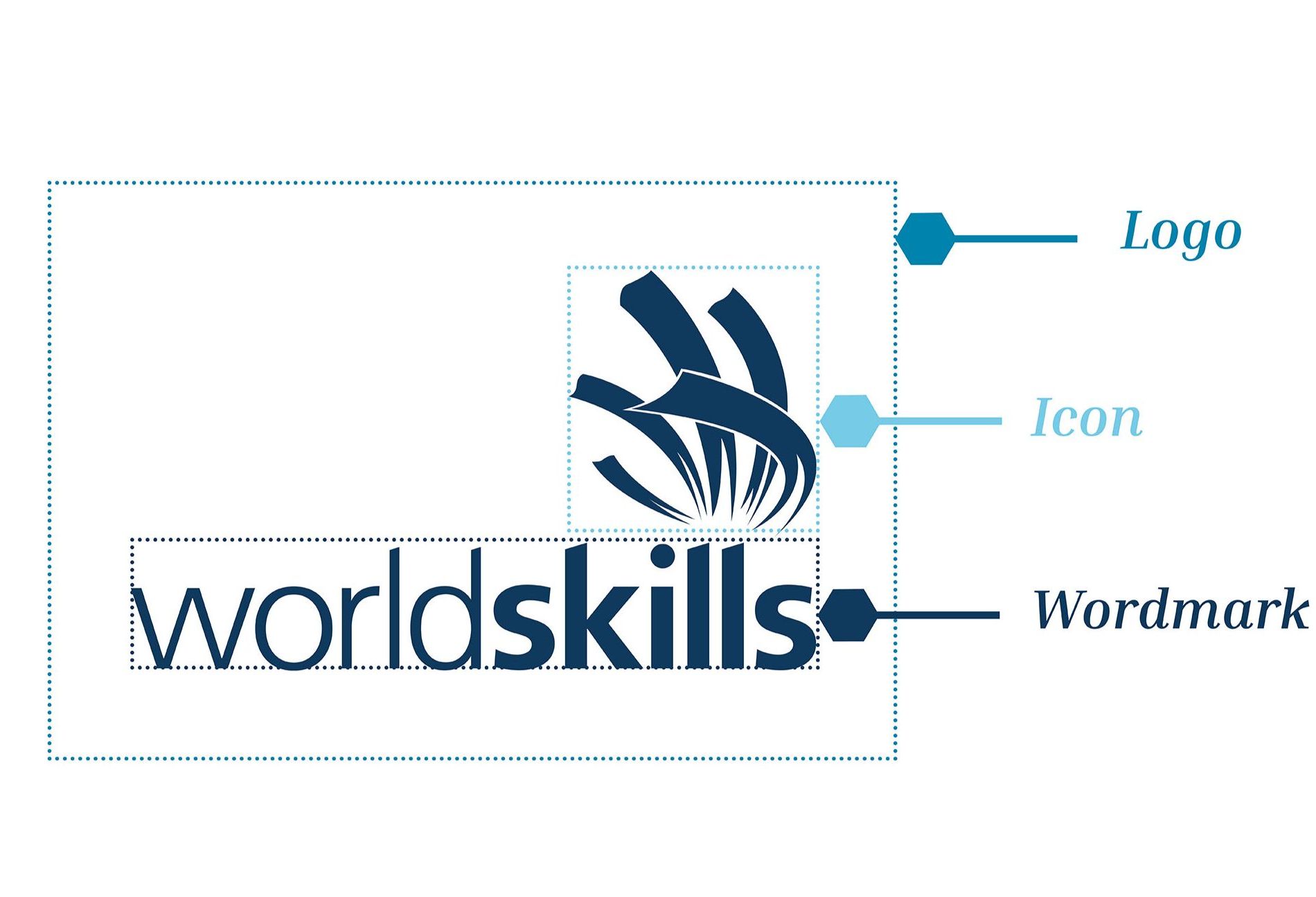
Clear space
The clear space is equal to the x-height (the height of the lower case letters).
To ensure the logo is easy to read, keep the background behind the logo simple, without a busy pattern.


Member, regional, and event logos
Together we represent a unified, global brand.
WorldSkills Members, WorldSkills Regions, and Competition Organizers connect to the global movement through the use of the WorldSkills visual identity, including the logo.
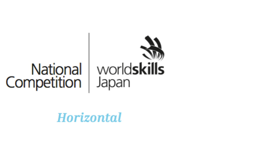
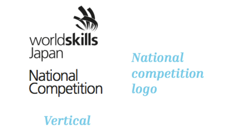
The Members, Regions, and Competition Organizers’ names are incorporated into the logo with descriptor text that is the same height as WorldSkills.
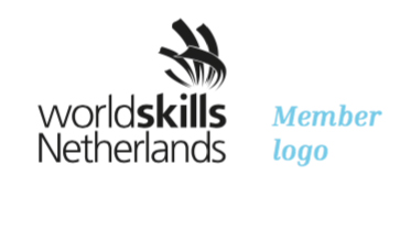
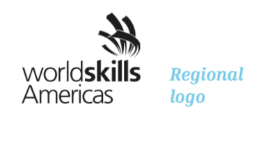
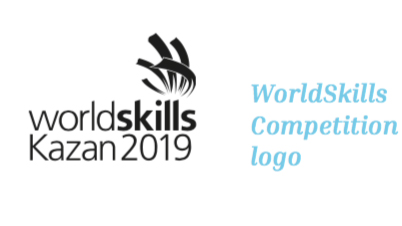
If there is additional text required, such as a national competition name or programme information — it appears outside the clear space around the logo.
Global Partner
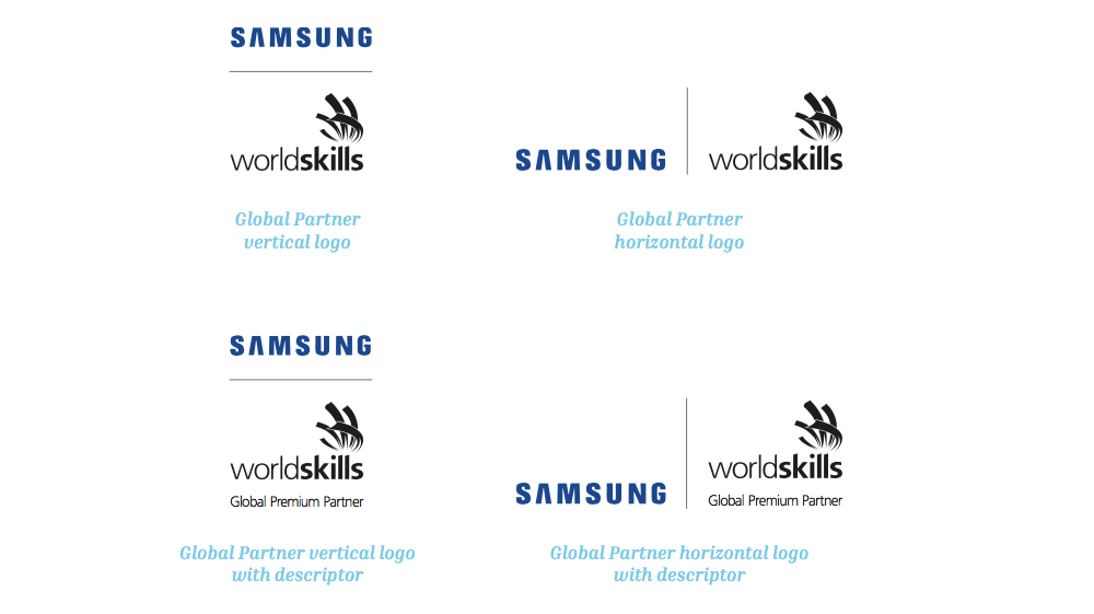
A joint Global Partner and WorldSkills logo reflects the partnership between WorldSkills and its official partners.
Our colours
Skills are engaging and energetic — so are our colours.
Pantone 102C
C5 M4 Y100 K0
R254 G227 B0
#FEE300
Pantone 214C
C9 M98 Y28 K2
R213 G16 B103
#D51067
Pantone 2955C
C100 M76 Y37 K28
R0 G55 B100
#003764
Pantone 0821C
C54 M0 Y8 K0
R114 G208 B235
#72D0EB
Pantone 1585C
C0 M68 Y90 K0
R255 G108 B12
#FF6C0C
Pantone 2617C
C87 M100 Y26 K16
R74 G13 B102
#4A0D66
Pantone 7704C
C92 M27 Y20 K5
R0 G132 B173
#0084AD
Pantone 332C
C47 M0 Y27 K0
R138 G226 B209
#8AE2D1
Building blocks
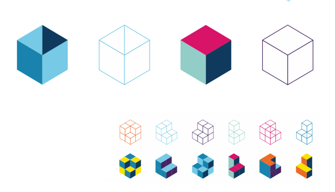
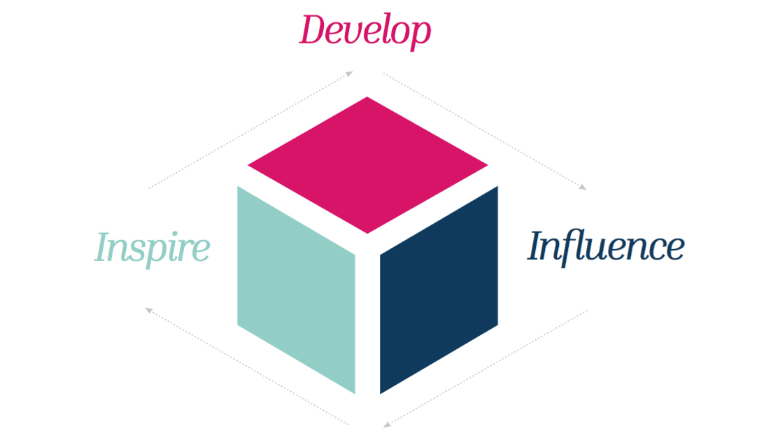
Skills are the building blocks of life. Our building blocks represent a multitude of skills and people, uniting and working together to bring change to our world.
The building blocks work together
The growth and success of WorldSkills relies on each element of the building block working together.
The building blocks are versatile
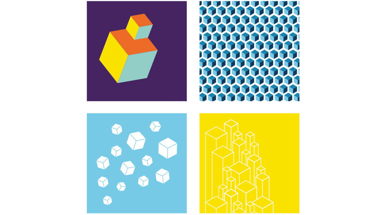
The blocks may be open or closed, solid or empty — depending on the message we are communicating.
They can be stacked, rotated, and resized.
You may choose to use a single block or many on a page. However, they must be clearly definable as blocks.
Using a single building block
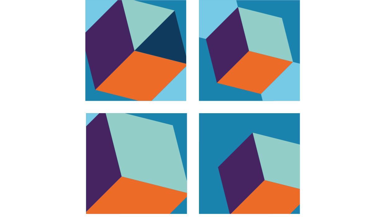
In addition to using multiple building blocks, a traditional enlarged WorldSkills building block can be used.
Elements are removable to accommodate imagery and text.
Fonts
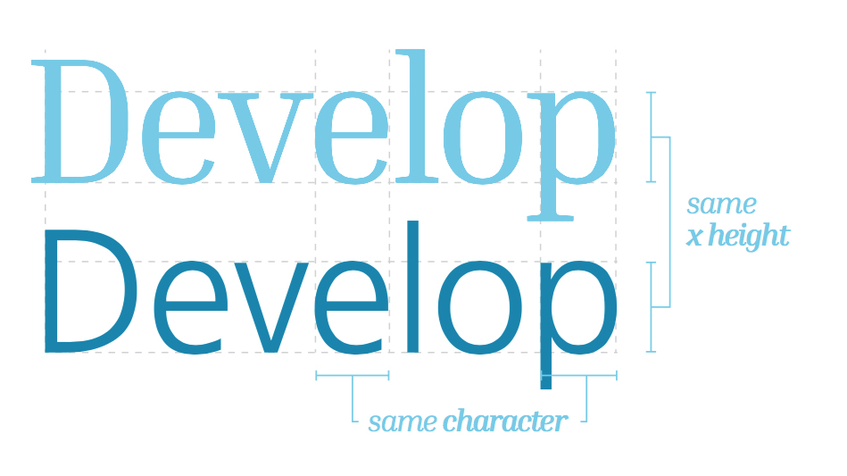
Frutiger is our primary font.
Inria Serif is also used to add variation and emphasis to text within designs.
We use Inter as the free replacement on websites and when Frutiger is otherwise not available.
We use seven weights of the Frutiger family and the complete Inria Serif family.
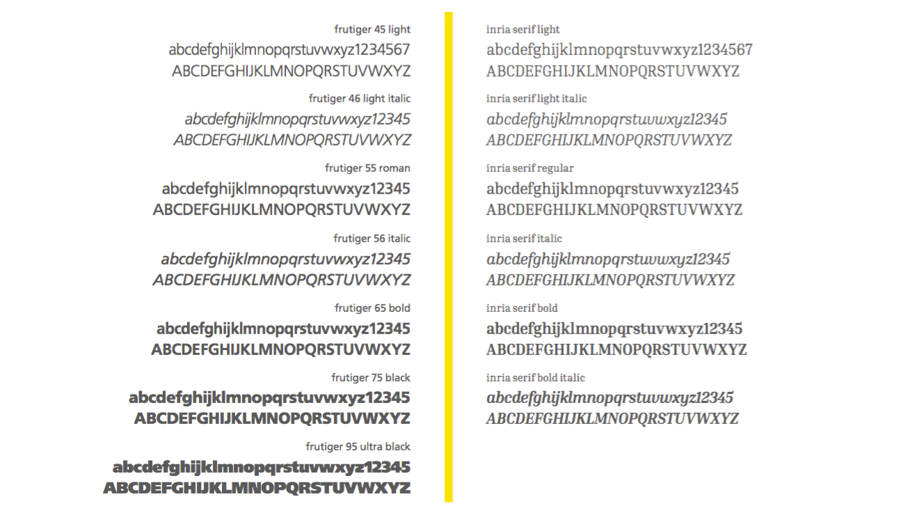
Frutiger is licensed through Linotype. You will need your own license and subscription to use it. Find out more about the options available at Linotype or choose your own service - it's up to you.
Inria is open source.
Imagery
Our imagery is youthful, energetic, and inspiring
Everything we do is to inspire young people to pursue skills. Our imagery reflects young people, skills development, and building a prosperous future.
Additional elements
Patterns
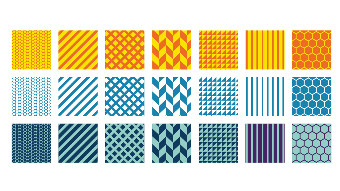
We use bold, geometric patterns that are dynamic representations of our building blocks.
Callouts
Our callouts can be used to emphasize a statement. They will also assist with layout design when using large images.
